By using this site you are consenting to our cookie policy. We don't save any personal data but we do use anonymous data with Google analytics to track things like traffic and user actions. This allows us to improve the site to give you a better experience.
Subscribe to our blog
Subscribe to be notified about new online presence tips & articles, nothing else.
We will never share your data to third parties. By clicking submit you are consenting to our data policy. You may unsubscribe at any time.

Adam Elsbury
Design better with Visual Hierarchy as a non designer
Introduction
What is a Visual Hierarchy & why is it used?
Visual hierarchy is a term used in the design world to describe the process of the arrangement or presentation of elements in a way that implies importance (Thanks Wikipedia!). In other words, designers use visual hierarchy to tell people where to look to find important pieces of information.
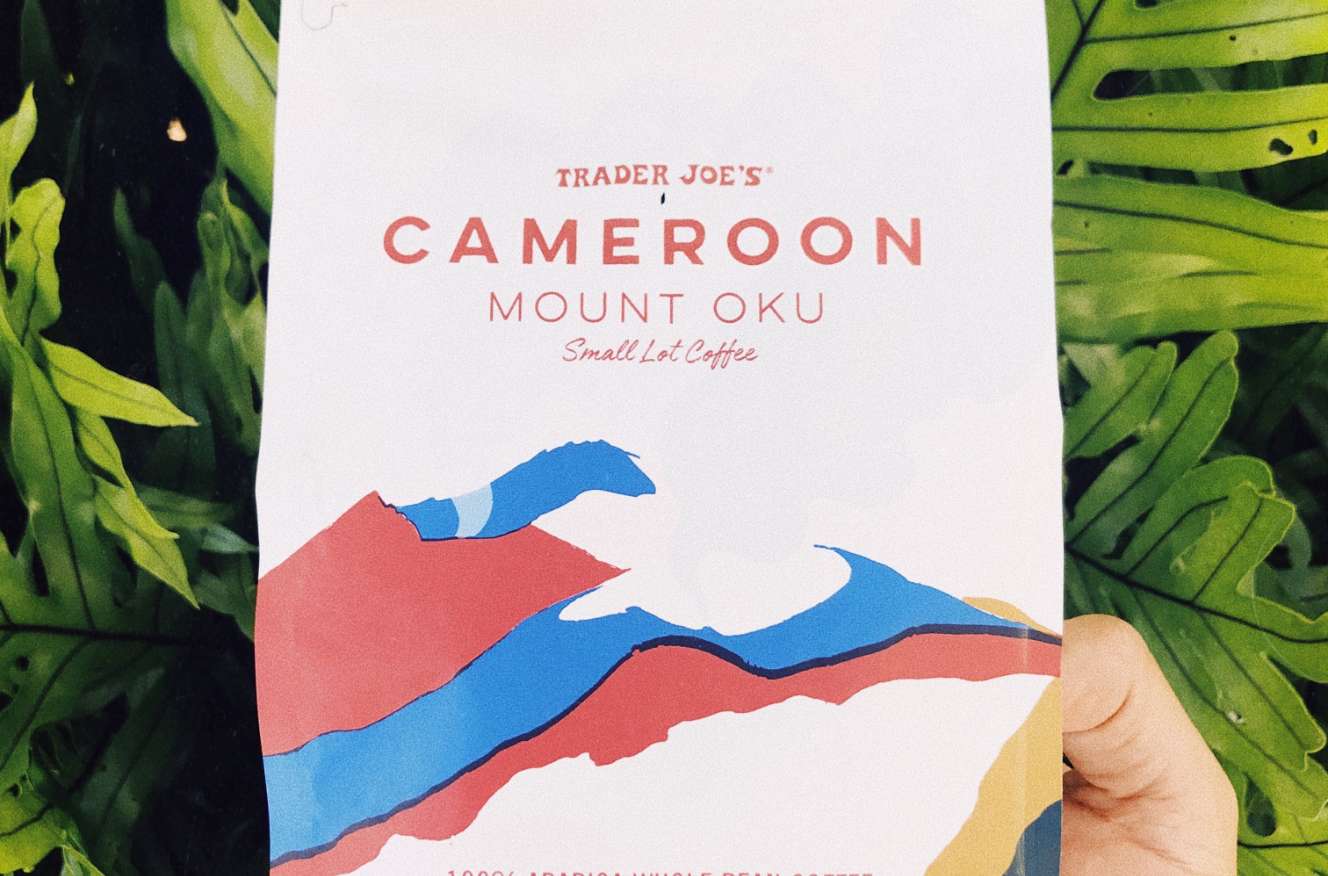
Take the above image for example. You might not realise the design effort that went into making that bag. The package designer has effectively used visual hierarchy techniques to get you to look at things in a specific order. Let's delve into why & how.
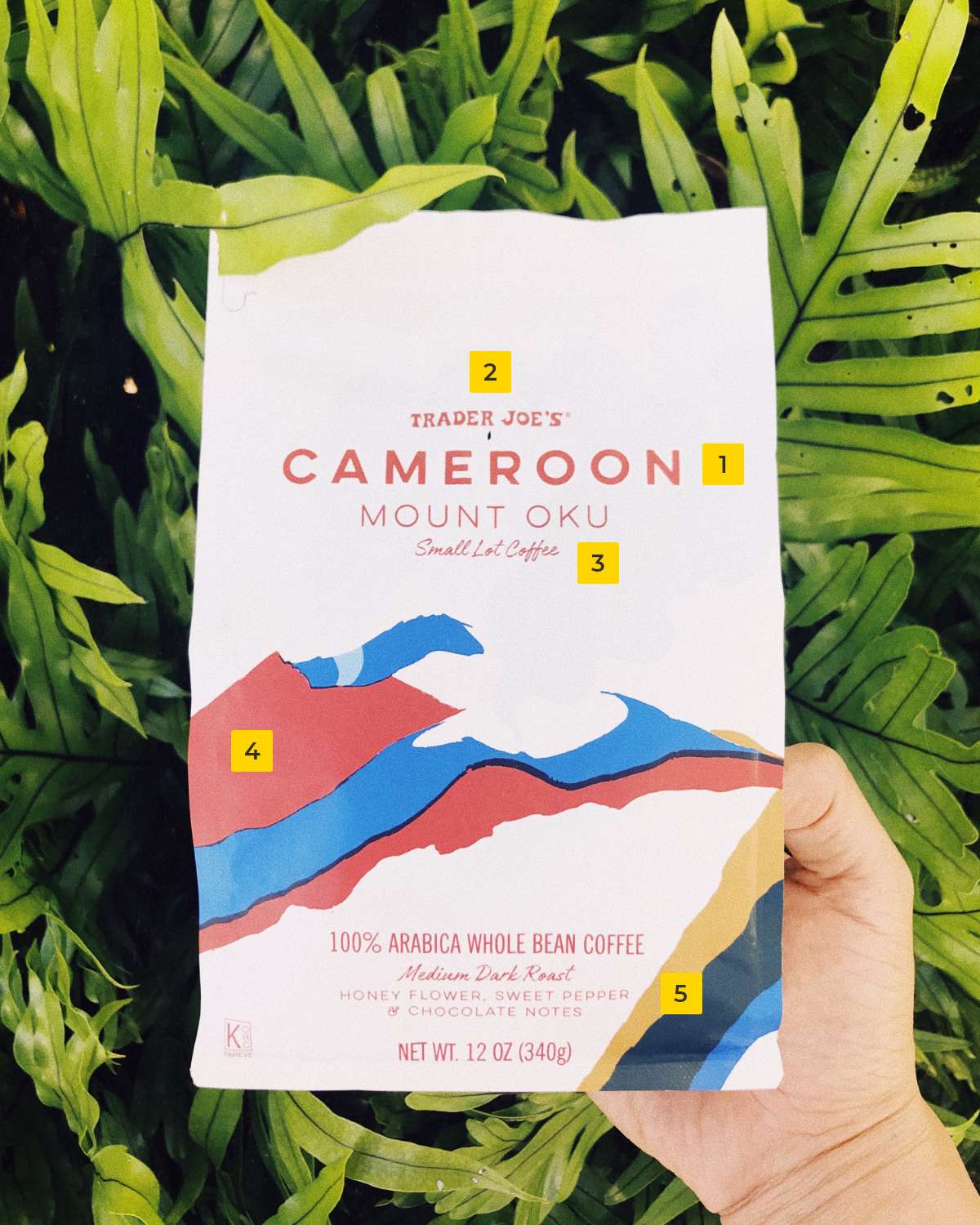
1. Product Title - “Cameroon”
For a coffee product you would be right in assuming people want to know the name first. So this is the element highest in the visual hierarchy. It has the biggest font, it's the most bold, it takes up the most horizontal space and its physically high up on the bag.
Notice how the company name is actually above this element but you looked at the product title first? The designer did this on purpose.
2. Company name - “Trader Joe’s”
Company name is also important to a potential buyer. A company brand promotes trust. People buy things from people they trust.
The designer has done something intentional here, the company name is actually the first text on the bag but it is read second. Thats because its the second most important element visible but still very important in the scope of the entire product.
So the font is smaller than the product title, its slightly less bold and takes up less horizontal space.
3. Description - “Mount Oku small lot coffee”
Again, the font used here is smaller and less bold than the first two elements. Still an important element for the potential customer but we’re slowly starting to move down the visual hierarchy tree.
4. Branding
This section is meant to have a bright colour contrast (notice the blue and red colours against the white background) to stand out to the customer on the store shelf. Less important than identifying elements but still important in the hierarchy.
5. Secondary description, flavour notes & weight
Now we are moving onto the secondary information. Notice the top three elements are grouped together and have lots of white space surrounding the text? That tells the customer they should look there first. It contains the most important information. Grouping elements signifies shared importance over other groups, individual element hierarchy shows importance within that group (don’t worry we’ll cover this in more detail later in the article!).
The following three elements are all secondary information. The top group are identifiers, they let the customer know what the product is. The bottom group of elements are influencing the customer to buy this product.
They are elements that help a customer make a purchasing decision when they are comparing different products. The flavour and weight of the bag could make a customer buy the product over a competitor that has less flavour and a smaller bag for the same price.
These elements have the smallest and least bold fonts and appear the furthest south on the product bag. This is because the customer is already interested in the product if they are reading this far. The designer doesn’t need this group to grab attention, its supporting or “Secondary content”.. Notice how even within this group there is still individual expression of visual hierarchy?
The net weight is still more bold than the flavour information. Why? I would assume it's because the weight of the product is more important to someone buying coffee than the flavour. Visual hierarchy decisions are based in research, nothing is random.
Breaking down Visual Hierarchy into digestible chunks
So you’ve seen a live example of a product utilizing visual hierarchy techniques & why designers do it. But that was only a few, there are lots of different techniques.
Like I mentioned before there are macro hierarchies and micro hierarchies and they all work together to form an overall hierarchy within the product or interface.
Macro hierarchies
A macro hierarchy is a hierarchy that addresses the importance of groups of elements within a whole page or product. This tells the user “Hey! This group of elements is more important than those other groups. Look here first!”.
Micro hierarchies
A micro hierarchy is a hierarchy that addresses the importance of elements within a macro hierarchy (group). This tells the user “Hey! This element within this group is more important than those other elements within this group. Look here first!”. Micro heirarches provide additional context once a customer has their attention on a group.
Visual hierarchy techniques
These are not in order of importance. Typically (but not always) the more techniques you apply to a single element or group, the higher importance it conveys in the hierarchy. Be careful not to go overboard, usually subtle differences can make a world of difference.
1. Size
Pretty simple. Bigger elements are looked at first within an interface. Size is arguably the easiest to implement and most influential technique to make people look at things you want them to look at. It's the reason newspaper headlines are bigger than everything else on the page.
Don’t forget size is contextual. If everything is big in an interface, nothing is. Be sure to make your most important elements bigger than everything else, not just big.
2. Contrast
People mistakenly think that bright colours attract attention. This is incorrect. It is contrast that attracts visual attention. If you have a web page with 40 elements and they're all varying shades of purple and yellow, nothing stands out. But if you have a web page with 37 grey, brown and black elements and 3 are purples and yellows, you’re on to a winner.
It doesn’t even need to be bright colours to effectively use contrast to direct customer attention. You can use a grey with more saturation or hue compared to the rest of the page.
3. Opacity
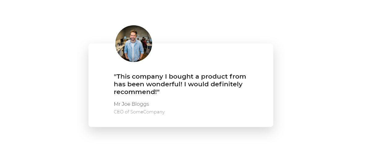
I wouldn’t advise making block elements different opacities but it is an effective technique for text. Especially when combined with size. Think of contact cards or testimonial cards on websites you have visited. They typically have a bold, important snippet of text supported by a smaller, less opaque header and an even less opaque sub header.
Make supporting elements a slightly lower opacity to achieve less importance compared to your primary content, but not so much where it affects readability.
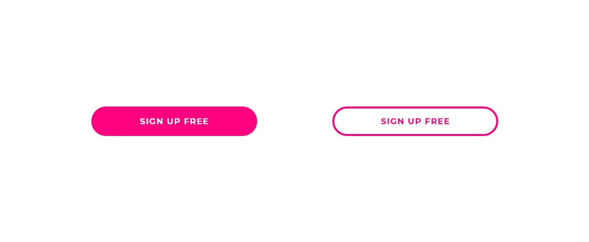
4. Font weight
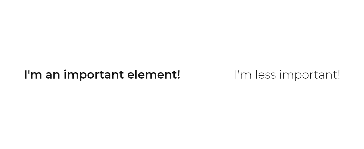
The more bold the text, the higher importance it conveys in your visual hierarchy. Simple. Especially effective when used for headers, sub headers and the like. It's also very effective to make important snippets of text within a large body of text bold like this to make specific phrases or individual words stand out against the rest of the body of text.
Below the two text elements are the same font & size. But one is much more visually apparrent than the other because of its font weight.
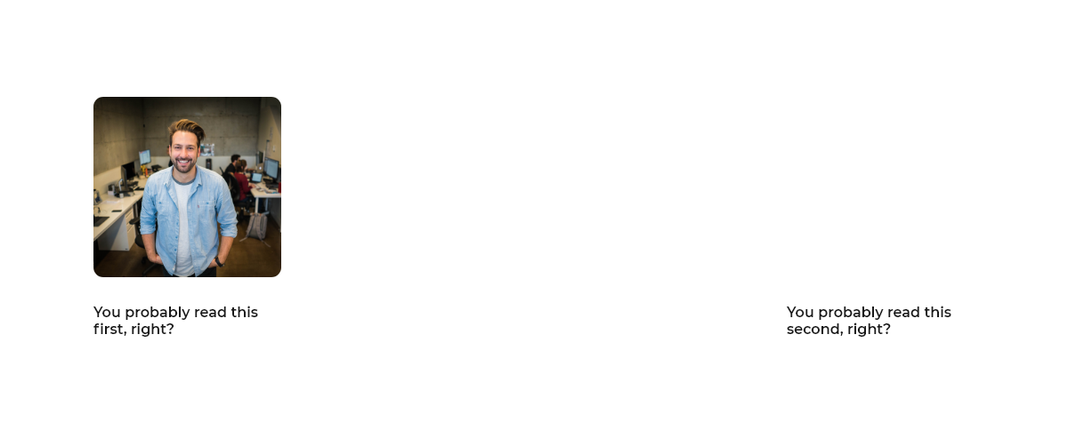
5. Position
With exceptions of specific demographics most people read from top to bottom. Have you ever opened a web page and scrolled right to the bottom and started reading up? Place your most important elements at the top of your pages and cascade downwards depending on importance.
6. Images
There is a wealth of scientific research on the fact that peoples visual attention is drawn to images before anything else, especially if a human face is present. My dissertation research in University concluded that people were around 30% more likely to click on a call to action button that had a picture of a smiling person close to it compared to an identical call to action button without an image.
You can effectively draw user attention and place more importance on elements close to or on top of images, especially if those images have human faces in them.
7. Movement
People look at things that move. Go stand (safely!) next to a road and stare horizontally across to the other side. Keep your head still and try not to look at the cars as they drive past. It's impossible!
This is because we have ancient DNA in our bodies where we correlate movement with danger. If we lived 50,000 years ago and were foraging for fruits in a forest and saw a bush move, that could indicate a predator was stalking us.
The same tendency presents itself in digital interfaces. People cannot help but look at moving elements, that's why videos are such an effective form of marketing. Be warned, use this technique sparingly. People tend to like to make their own way through an interface and an element jiggling about shouting “HEY OVER HERE!” can annoy people. Think of ad pop ups on news websites.
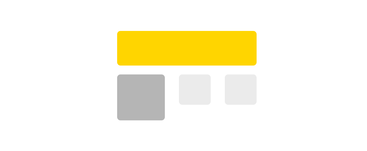
8. Internal surface area
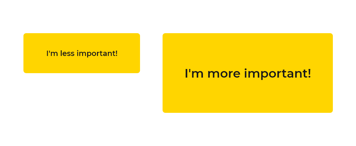
Similar or even identically shaped elements with more internal surface area have more weight in a visual hierarchy. Look at the two buttons below. They're the same shape, same dimensions, same font weight but the button on the left is more visually apparent. Why? Because there is more visual data inside the element.
This technique is especially effective by declaring relational importance between buttons. For example, if you have a website that has a subscription service, you may have two primary calls to action. One for the customer to subscribe and the other to sign up for a newsletter. In relation to the rest of the interface these two elements are very important but one button is clearly more important than the other.
Use less internal surface area on secondary elements in close proximity to priority elements to indicate less importance in the visual hierarchy.
Summary
You’re armed with 8 new design techniques to level up your website. Remember, subtle differences can usually go a long way and try not to overdo it with too many techniques being applied to a single element. Usually one or two will do the trick.
Also, don’t just go applying these techniques to random elements. Have a clear goal in mind when constructing your web page. List every element in order of importance and then translate that to your web page design using a visual hierarchy so the customer understands also.
If you want to go a step further categorise your elements into groups and list those in order of importance compared to other groups and then order their children elements by importance.
Happy designing! If you have any questions reach out to us at hello@blackskull.agency or sign up to our mailing list to be notified of when we release new articles.
Get your free quote today.
Take the first step to delivering a better web experience for your consumers.
07506782509
hello@blackskull.agency